


Background
Telstra is Australia’s biggest telco with nearly 19 million customers.
In 2011, we helped them to reconnect with customers by shedding their monochrome image and embracing life in full colour.

Problem
In 2011, Telstra had lost favour with their customers. To fix this they introduced a new tagline, designed to highlight the intrinsic human need for connection:
‘It’s how we connect.’
Unfortunately, the way they were expressing themselves didn’t connect with anyone. It was cold, corporate and uninspiring.
Telstra needed a new brand expression. One that was excited about the potential of technology to make life more vibrant.
The world of blue
The previous brand identity was a ‘world of blue’ – a branded world of Telstra that customers were invited into. This was a consequence of conventional brand identity thinking that a brand should own a colour.
However, this theory had led to a very corporate presentation of telco. Our hypothesis was, if Telstra wants to connect with its customers, it should reflect the lives of its customers rather than invite them into their ‘world of blue’ with a vibrant and expressive brand identity that’s excited about the potential of technology.
All the colours
Inspired by Pink Floyd's Dark Side of the Moon album artwork, colour became a metaphor for one company (white light) that can split itself into the full spectrum of tones, emotions and needs of its customers.
Colour, therefore, represents the diversity of people, products and services that the Telstra brand touches. It allows for one organisation to flex itself appropriately to whomever it's talking to and what it's talking about.
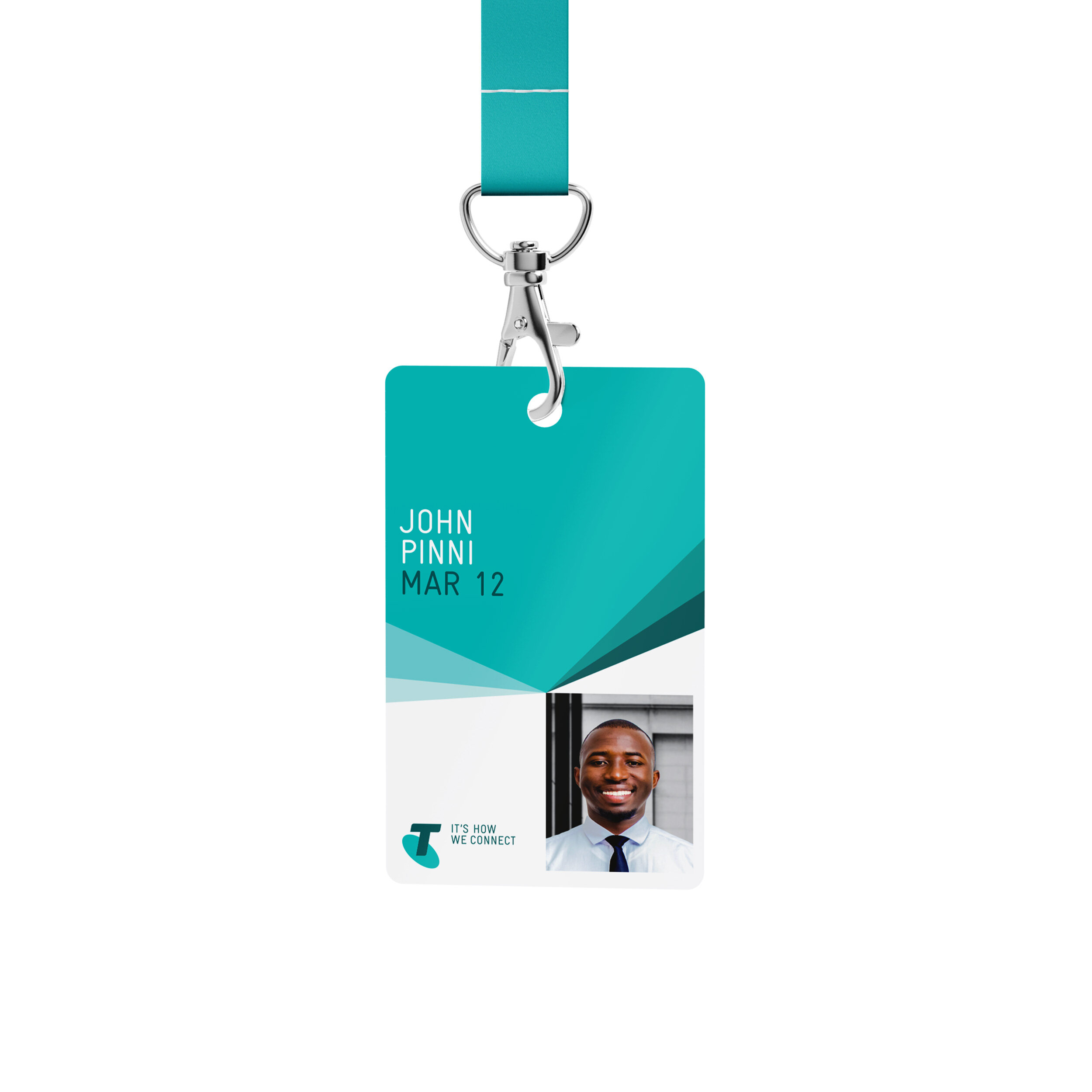
The Spectrum
Also inspired by the splitting of light by a prism, ‘The Spectrum’ is a flexible graphic device to hold images and text. Conceived as a connection device, The Spectrum represents the Telstra Network, with every ray beaming outwards to connect people, products and services.


The brilliant connected future
In 2013, Telstra introduced a new purpose: ‘To create the brilliant connected future for everyone.’
Brand 2.0
This purpose highlighted Telstra's mission to create the technologically driven future we've all been promised. We were asked to update the brand identity to reflect this new purpose and give it a visual upgrade which represented the aspirational future they envisioned.
Design through discovery
We returned to first principles by distilling the existing identity into simple visual principles. These were: colour, angularity and light. From here we sought to define Spectrum as a visual language rather than a graphic device.
Using these principles, we devised a series of experiments to find a new expression of Spectrum which felt familiar yet upgraded for the future.
To reflect the new purpose we put particular emphasis on light (brilliance) and created video experiments with coloured acetates and a light source with the intention of discovering a new motion mechanic for Spectrum.
Eventually we had learned enough to be able to pass the video tests to a motion designer to further progress the experiments inside the computer and develop the brand's motion mechanics.


Telstra
Brand identity
DESIGNED AT INTERBRAND
Creative Directors: Chris Maclean, Mike Rigby
Design Directors: Andrew Droog, Ami Gainford, Tom Carey, Ben Miles
Designers: Eric Ng, Flicka Williams, Benja Harney, Mike Tosetto, Joao Peres, Ami Gainford, Debra Jason, Claire Theophane, Annah Brocklebank, Briton Smith, Dan Ingham, Ed Hall and so many others