

Slate
Brand Identity
It was clear on first appraisal that Slate had fallen into disrepair over the years. It lacked a cohesive visual voice and was in dire need of a redesign. After speaking to a cross section of people we uncovered a very strong sense of self that nobody could pin down but was described internally as ‘Slateyness’. We knew our job was to express ‘Slateyness’ visually in a way that lived up to the tone and quality of the journalism.
Slate’s process is messy and nonlinear. We knew Slate’s personality was far from clean cut. It’s irreverent, quirky, jarring so a polished representation of the brand just wouldn’t do justice to the personality. It had to fly in the face of convention and be counter to the plethora of buttoned up news publications that saturate the internet. It had to feel off-kilter.


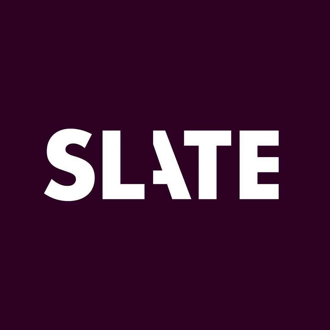
Our visual research led us to layers of noise, microfiche, zoom-ins, and handwritten scribbles. We devised a technique of layered ‘slates’ that would bring structure to article layouts and reveal the story for the viewer as they scroll the page. This idea of layering and revealing was echoed in the logo. To inject the wit and whimsy that’s so true to the voice, we created a photo-illustration style that could take the place of stock photography and instantly bring ‘slateyness’ to any article.


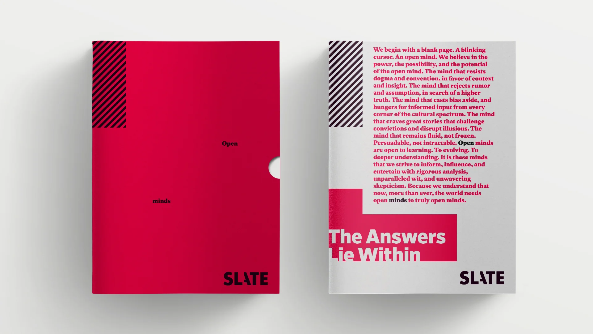
We introduced new typographic styles that sought to represent different textures of news and piles of press clippings with fonts that could be both illustrative and functional assets. We did this by paring a Serif (Register) and a Sans-serif (Retina). The only thing we kept from the old Slate was the tone-of-voice and the maroon color, albeit with a slight tweak to make it a little more punchy. We also gave them a wider palette as an aid to navigating sections.

We also gave Slate a photomontage image style that allows them to create header images for articles and cover art for Podcasts in a way that represents the quirky character of Slate’s journalism. A toolkit of patterns and textures allows them to quickly create artwork at the pace of the journalism using supplied and stock photography.


Designed at Gretel
Creative Director: Chris Maclean
Design Director: Dylan Mulvany