


Background
Every year, OA hosts over 600 performances in venues across Australia and Asia including Sydney Opera House and The Arts Centre Melbourne.
A new artistic director introduced a bold new vision:
Opera should be for everyone.

The problem
With attendance dwindling, Opera Australia needed to attract new audiences.
Unfortunately, many people think opera is stuffy, boring and all the same.
To entice them into opera, we needed to change those misconceptions.
The solution
We presented opera as an exciting, contemporary, multi-genre experience with an identity that opens up opera to help people reconsider buying a ticket.
Bar lines
Inspired by musical notation, bar lines represent the many different dimensions of opera. From the history of the music to set design and everything in between, there’s so much more to opera than the stage performance.
Genres
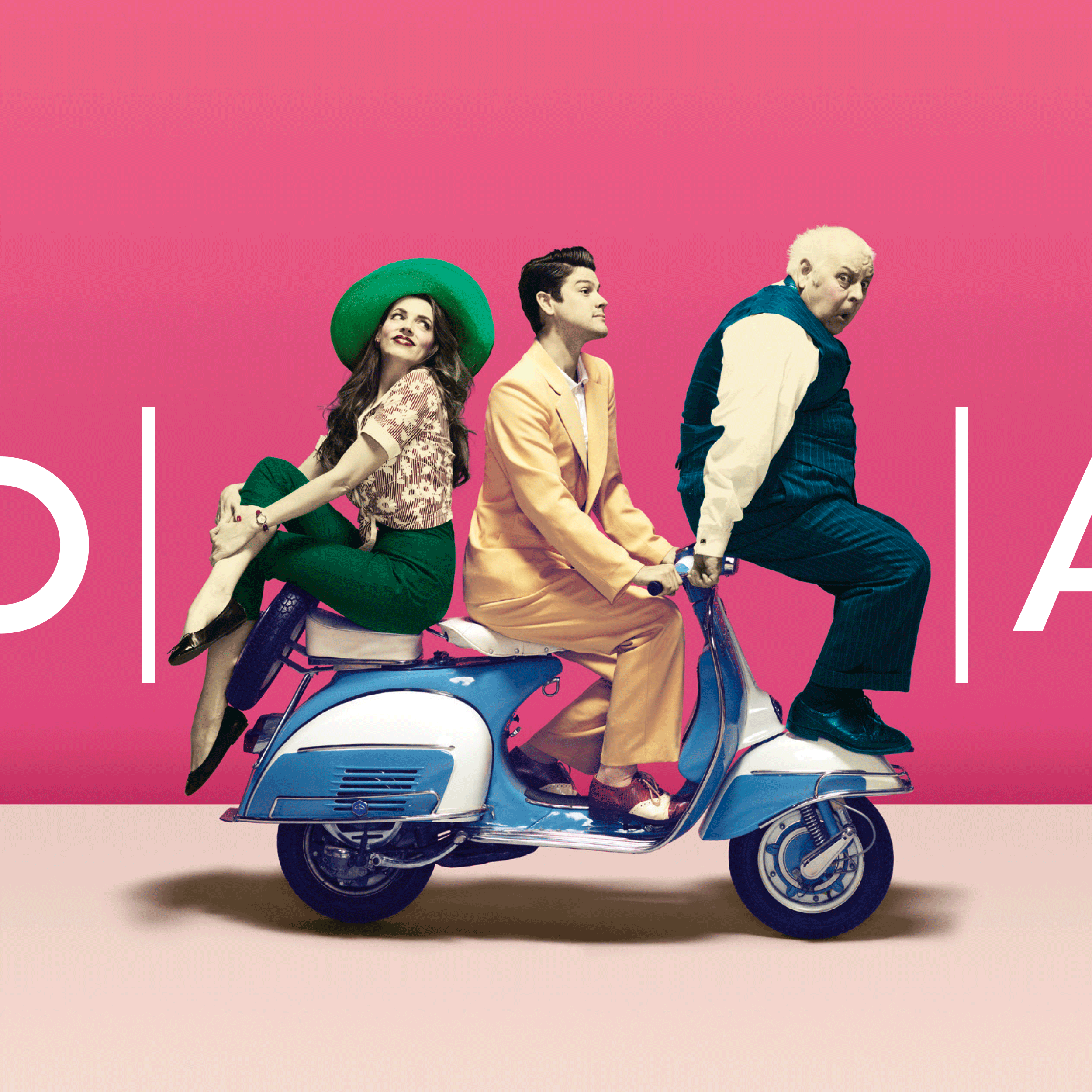
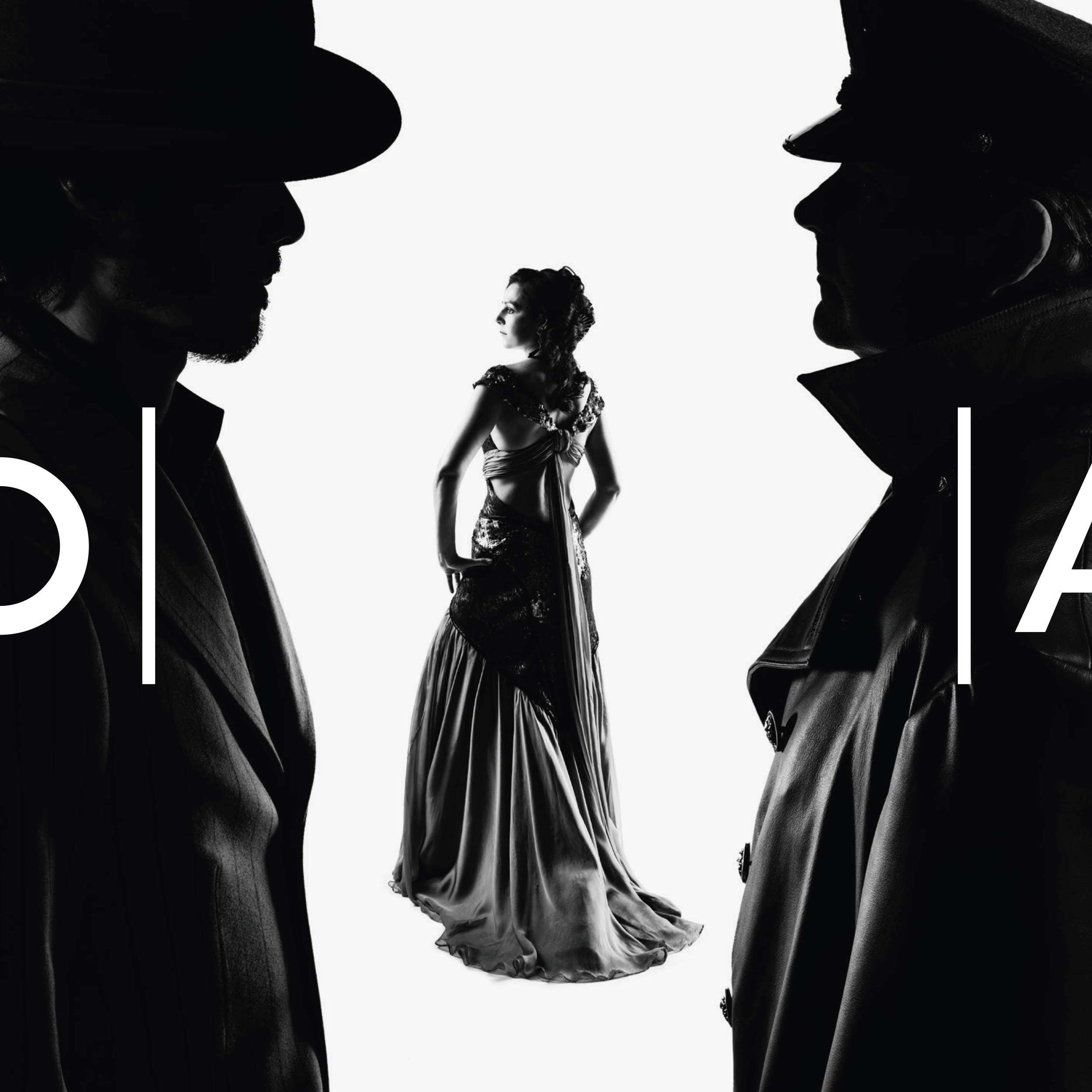
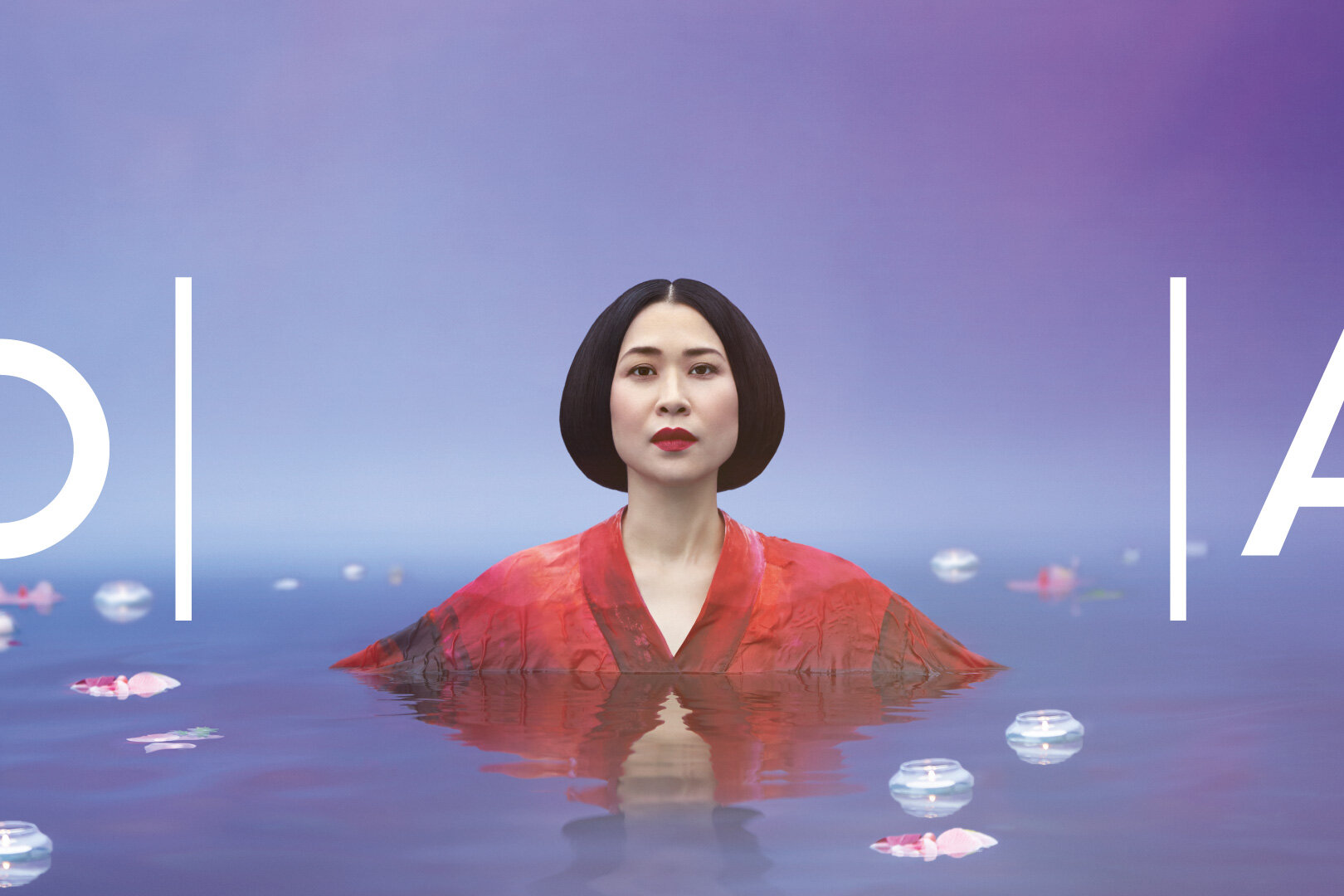
A popular misconception is that opera is all the same. To change that attitude we created evocative imagery that highlights different genres within opera.
Anything between the OA brackets is opera and is Opera Australia, helping audiences reconsider opera.


Opera
Australia
Brand identity
With a dying hard-core following, Opera Australia needed to attract new audiences. However, for those not in the club, opera can be an inaccessible, intimidating art-form to get into.
Artistic Director, Lyndon Terracini, recognised that to attract new audiences they would need to break down those barriers that stop people buying a ticket and set opera free from its stuffy preconceptions.
His refreshing new outlook – that opera should be for everyone – included performing in non-traditional venues as well as introducing more diverse programming to the main-stage, often involving cutting-edge technology.
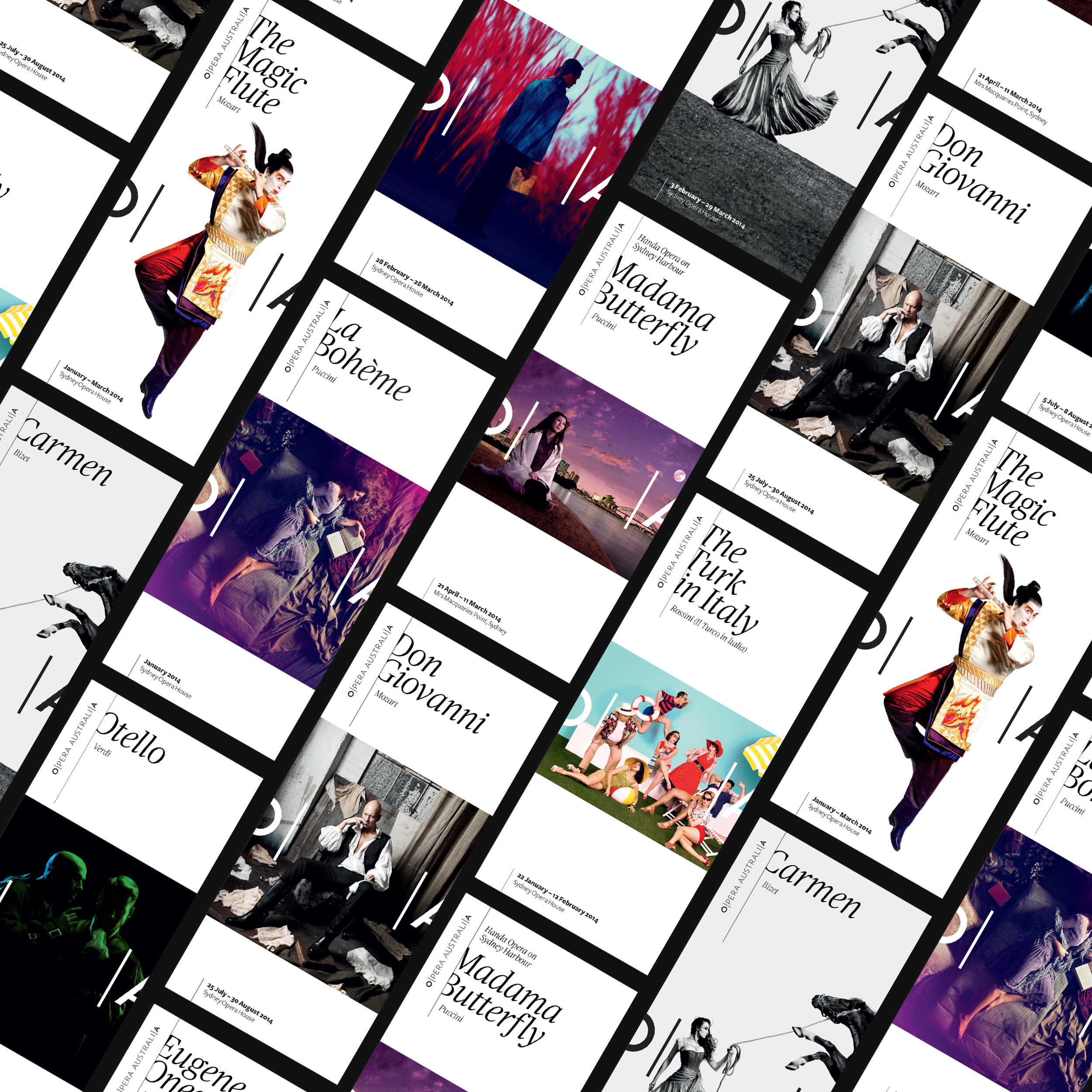
To suport the reinvented Opera Australia, we devised an identity system that allows us to open-up opera. Just like the opening of theatrical curtains, the logo expands from OA to Opera to Opera Australia. Anything contained between the OA brackets is opera and is Opera Australia, helping potential audiences think again.
Within the brackets, vertical lines represent not only the music, but the many dimensions of opera. From costume design, to set production – there’s so much more to opera than opera.
Images were designed to communicate the genre of productions; helping people understand opera's diversity. Comedies feel funny, tragedies feel sad, and romances feel passionate. We engaged the talents of internationally acclaimed Australian fashion photographer, Georges Antoni to bring a contemporary twist to classic content.
Designed at Interbrand
Creative Director: Chris Maclean
Design Director: Ami Gainford
Designer: Eric Ng
2014 Season
Designer: Eric Ng
Art Direction: Eric Ng, Ed Hall
Photography: Georges Antoni
2015 Season
Senior Designer: Tom Carey
Designers: Michael WebsterArt Direction: Tom Carey, Ed Hall
Photography: Georges Antoni
Awards
Winner Best of Show Brand New Awards 2013
Winner Best of Category Comprehensive Identity Programs (Professional) Brand New Awards 2013
Awarded no11. in Brand New's Best Brands of 2013
Awarded no9. in Brandemia's Best Brands of 2013