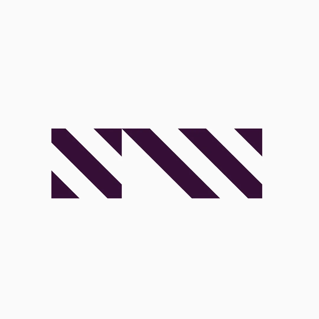
Norwest
Brand identity
It’s 2016. City centers are overflowing, technology is transforming the way we work, and Sydney is slowly sprawling north west. How do you realign a city around a new focal point?
Norwest is an area of northwestern Sydney that is twice the size of the central business district. Its projected growth puts it on track to become a new city centre by 2030. But it’s not there yet.
Right now people think of Norwest as a light industrial area, far from the heart of the action, if they think of it at all. To realise their vision, Norwest’s developers needed to excite potential residents and businesses to become a part of Sydney’s future.
20 years from today.
We started by working with the developers to envisage Norwest beyond 2030. We projected that in order to succeed, Norwest must become a beacon of innovation.
It will need pioneering architecture, intelligent infrastructure and a new approach to community. Guided by this vision, the Norwest of the future will be so compelling as to be magnetic.
Magnetic Norwest
The concept of magnetic attraction is at the heart of the brand identity. The brandmark is inspired by the needles of a compass, with the six lines pulled north west towards Sydney’s emerging centre.


