


Sydney Opera House
Brand Identity
Brief
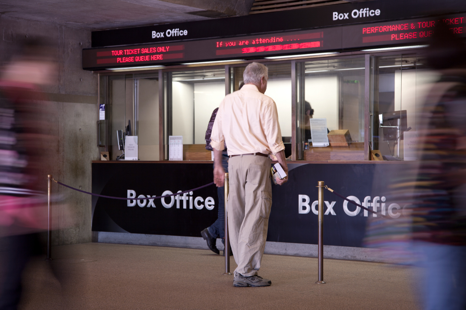
With its iconic sails and incredible performances, the Sydney Opera House has long been one of the world’s most loved buildings. But it had its problems. It was finding it hard to communicate with its audiences. There was no thread uniting its different experiences, departments and partners. And while more people were visiting than ever before, most simply snapped a selfie outside. They weren’t actually coming in. We needed to find the Sydney Opera House’s voice, and let people know that although things look great from the harbour, the real magic happens inside.
Solution
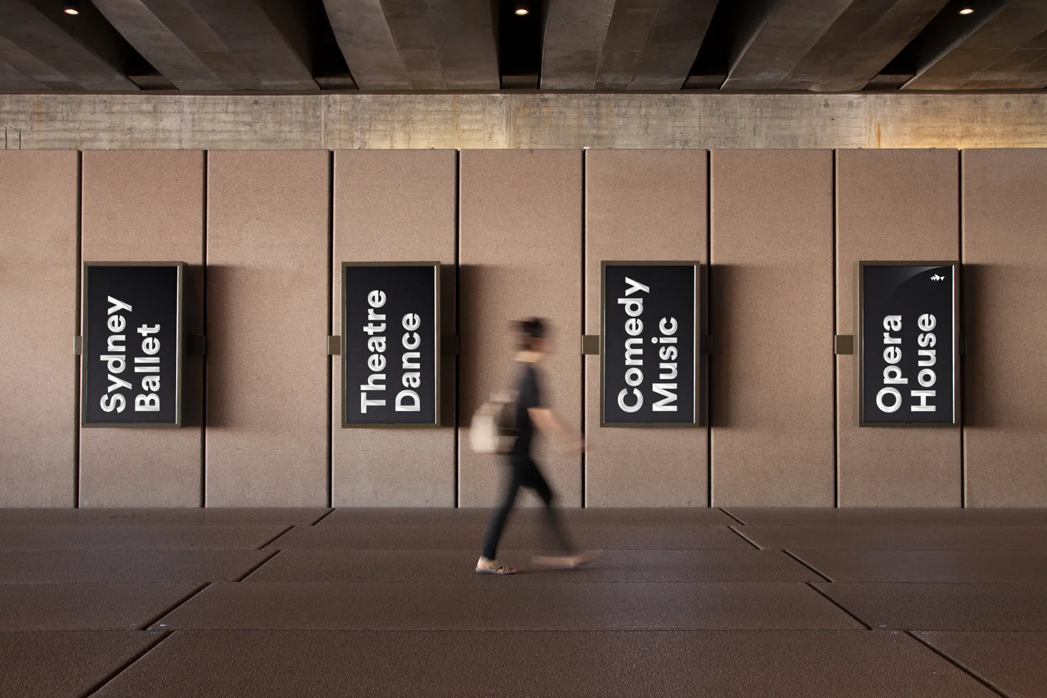
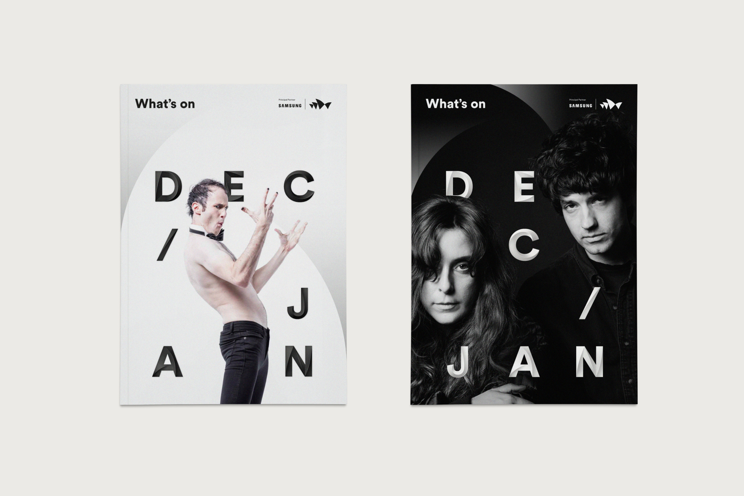
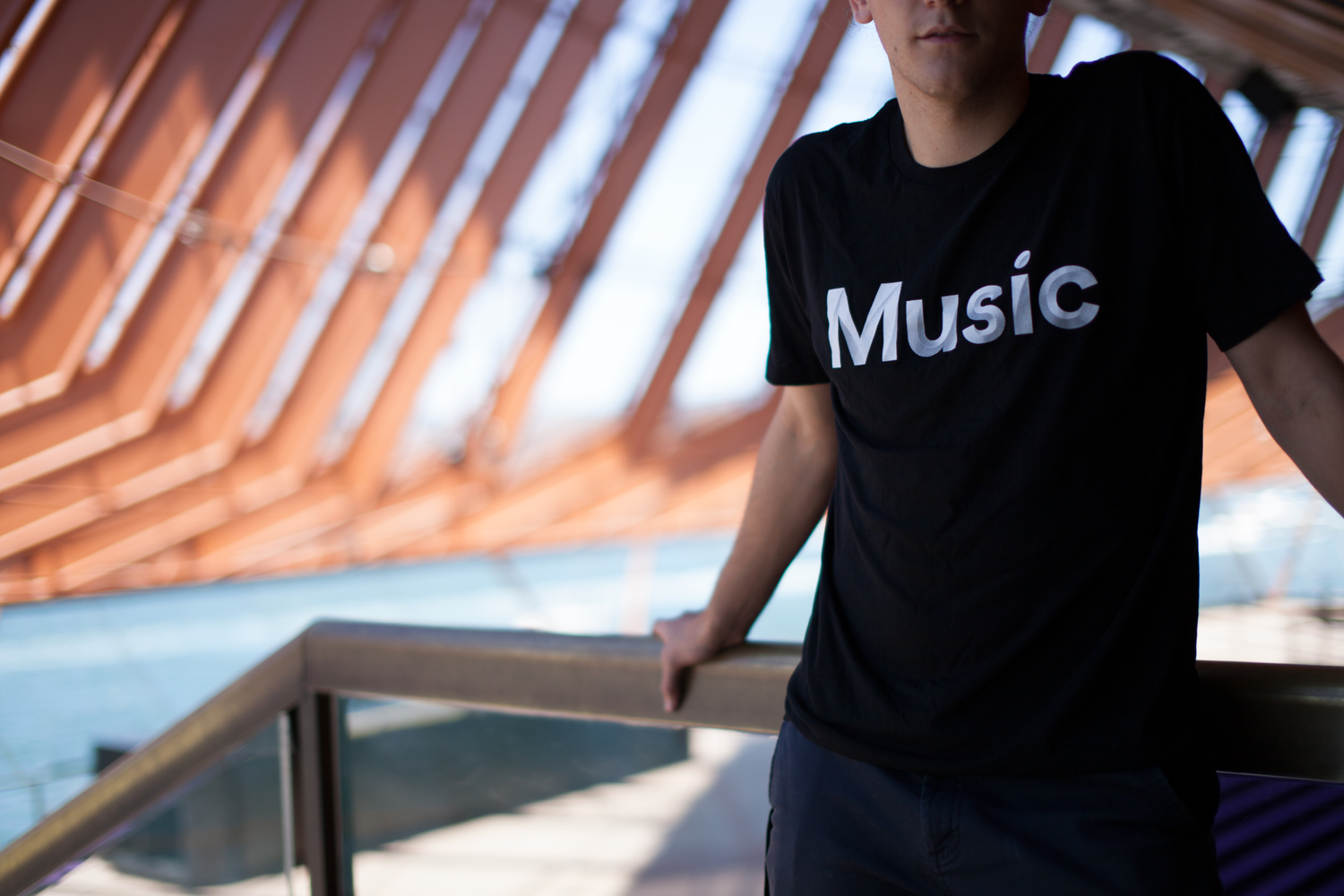
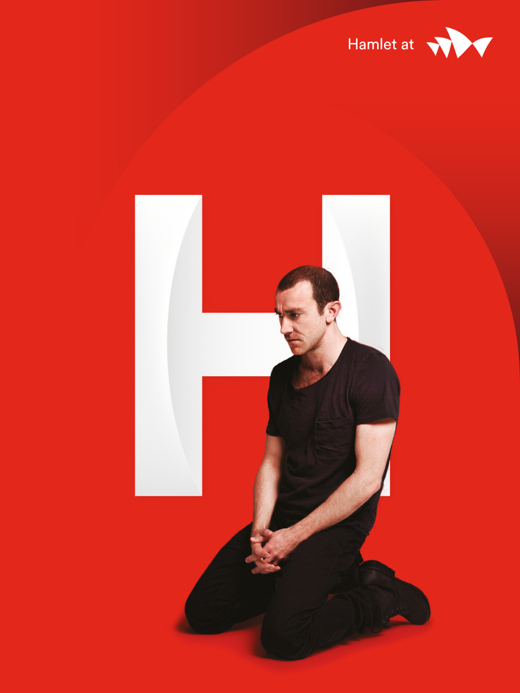
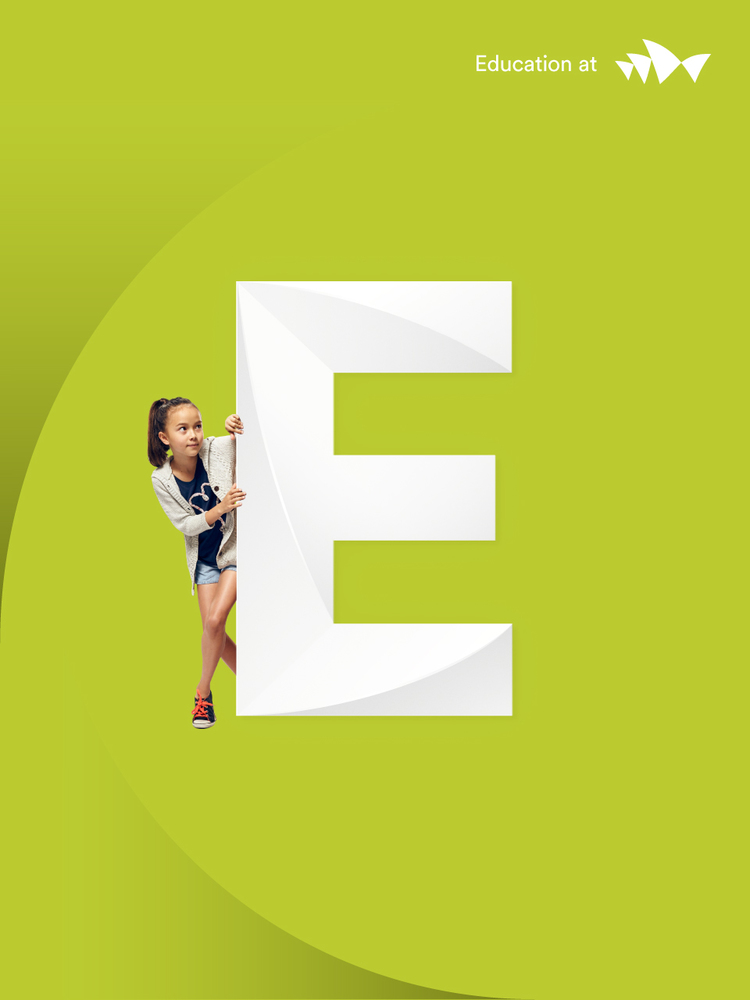
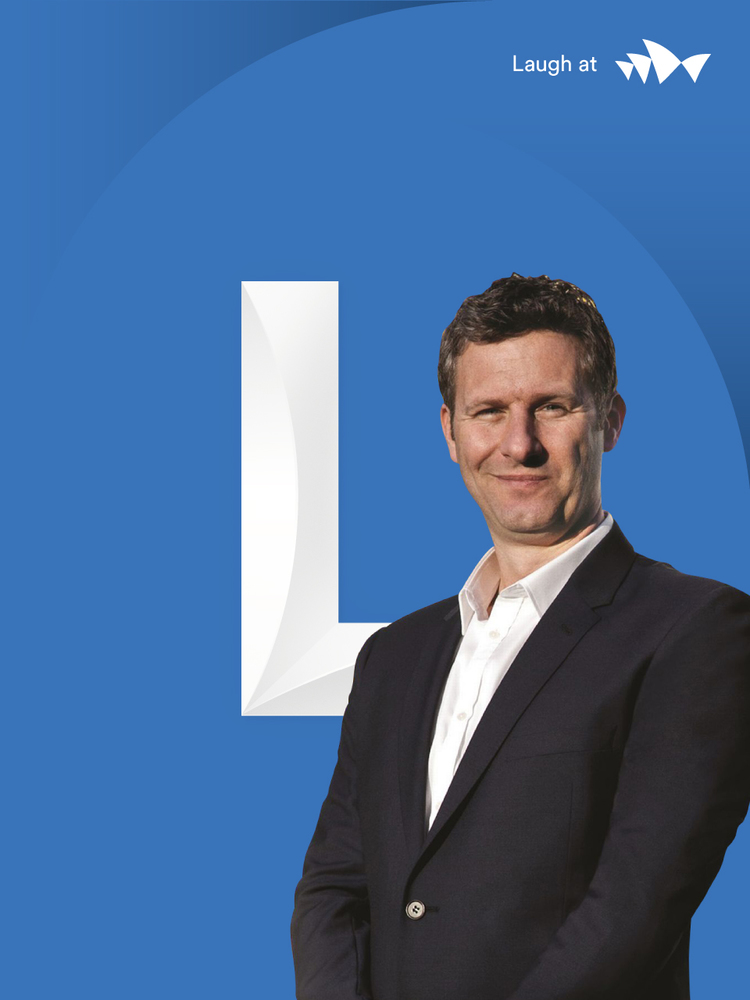
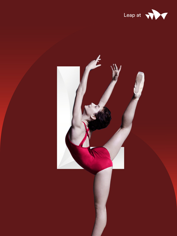
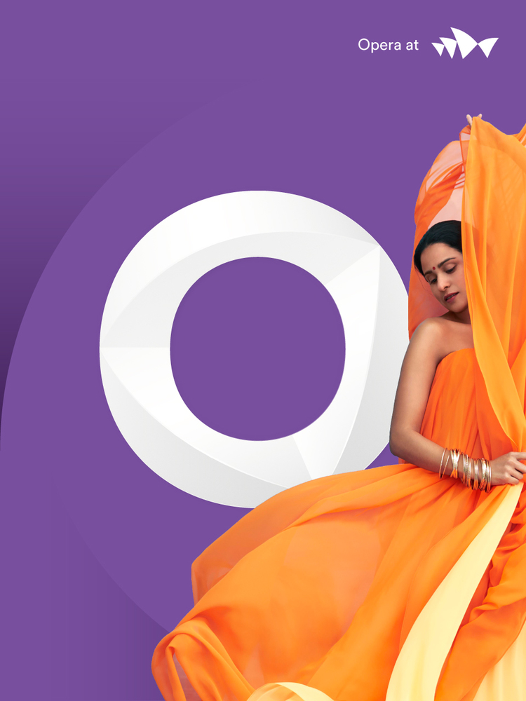
So we created Shifting Perspectives – a brand idea that inspires conversation around culture and art, and helps visitors understand there’s more to the Sydney Opera House than opera. Paired with Shifting Perspectives is a sculptural form language. Sails are used to draw attention and interact with photography, while the 3D Utzon typeface reflects the contours of the building itself. Together, they complement the content of any show poster or message, before bringing the focus back to the master brand.
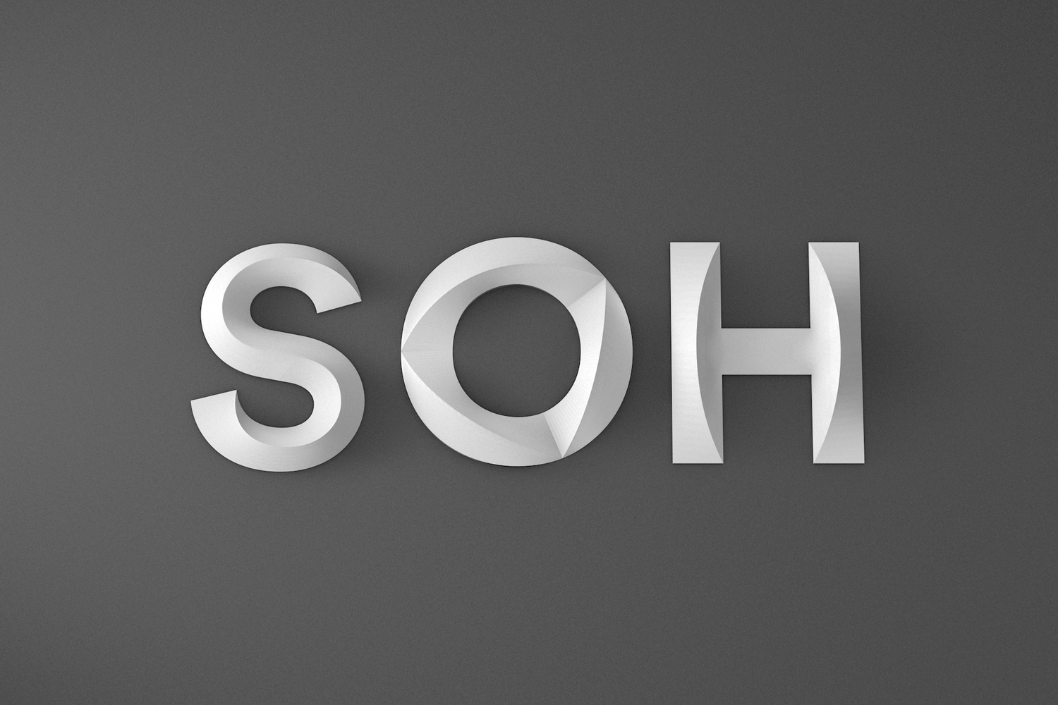

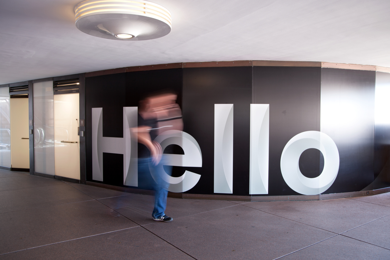
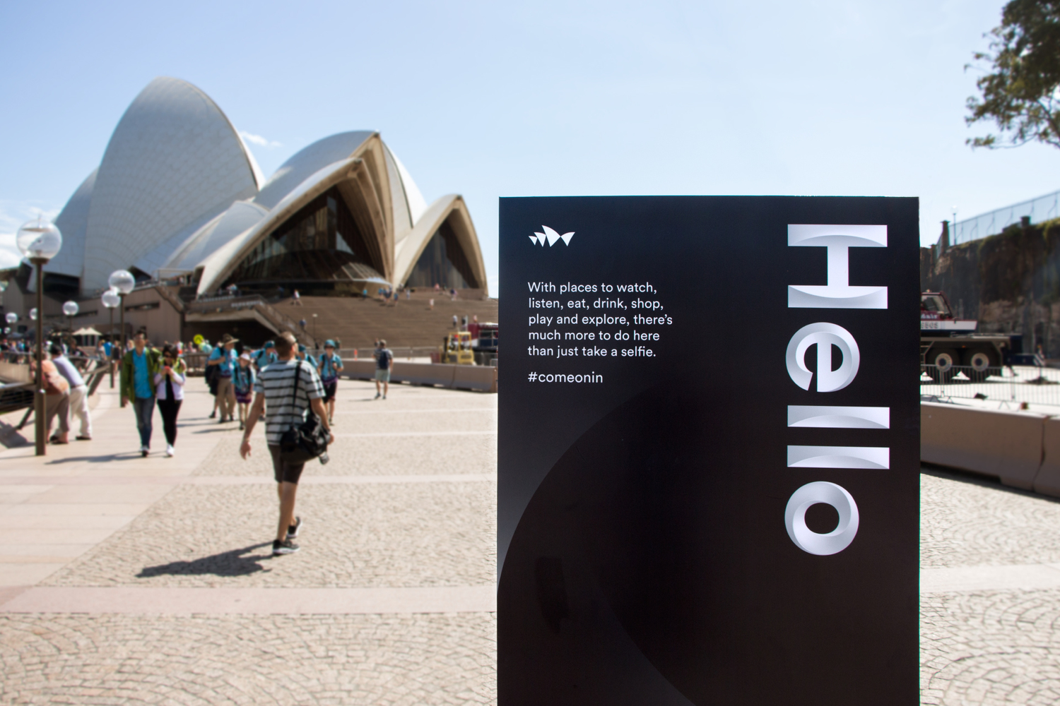
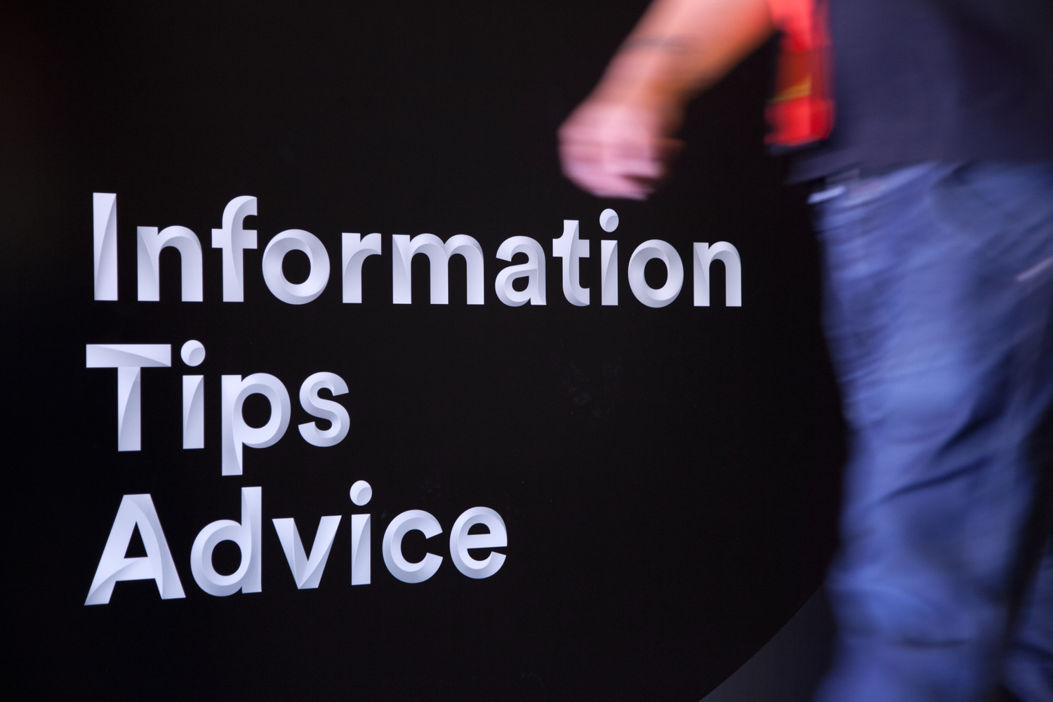
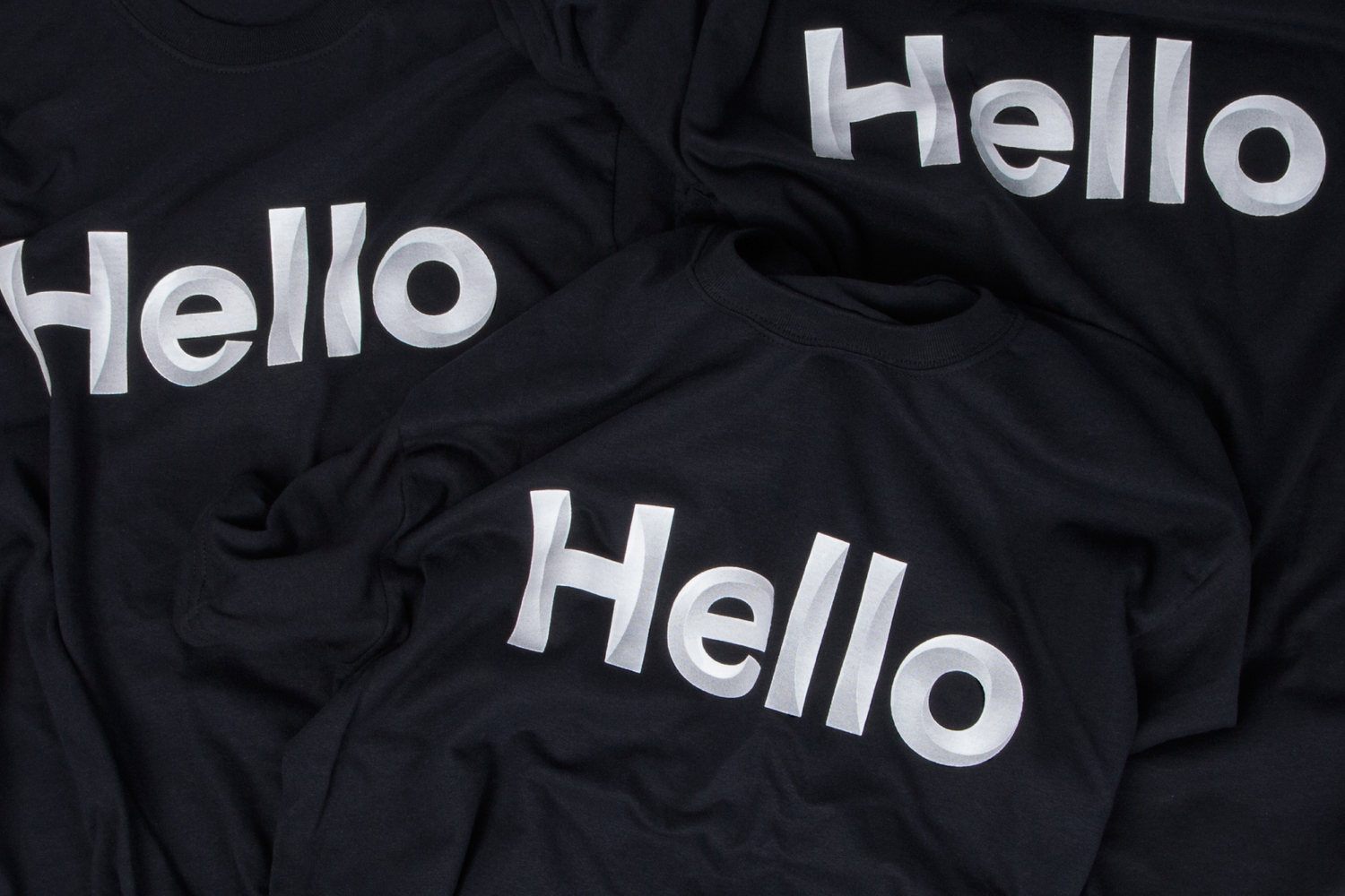
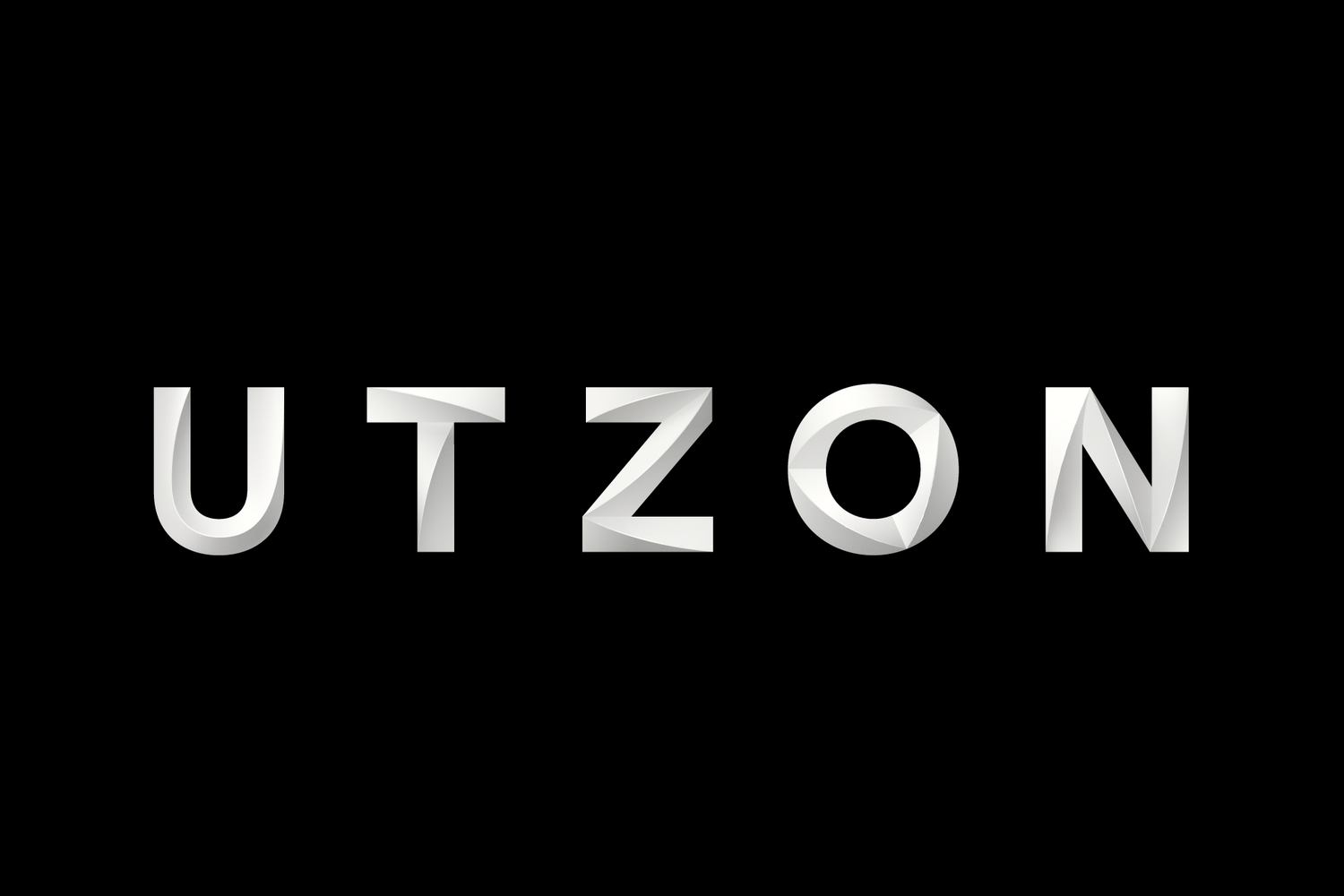
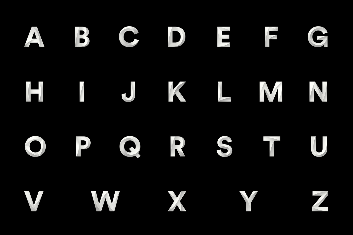
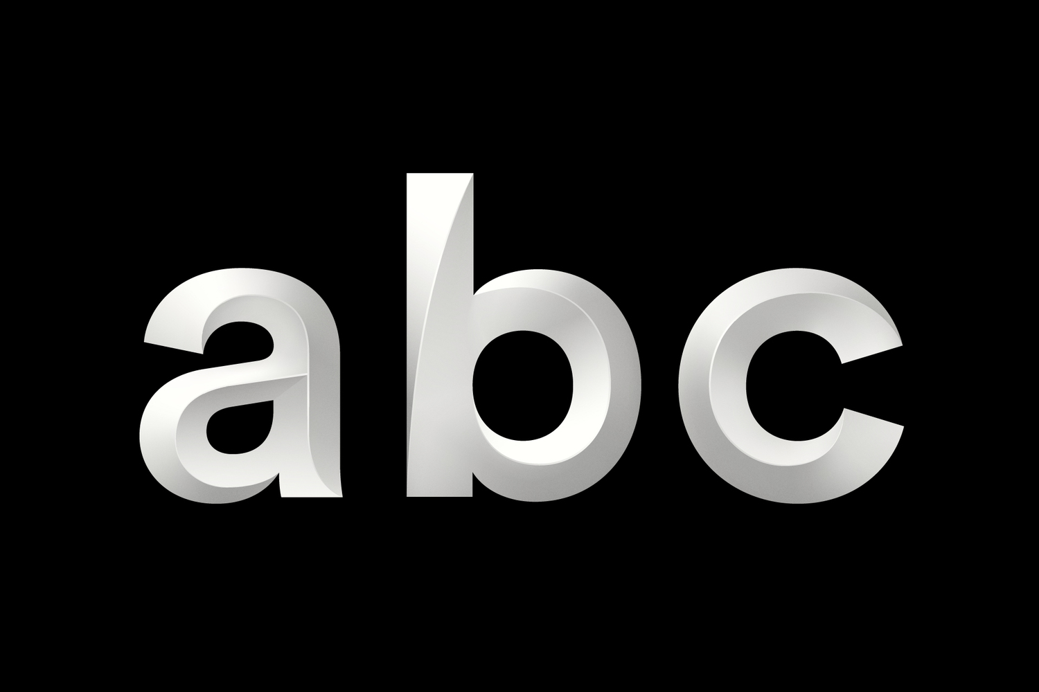
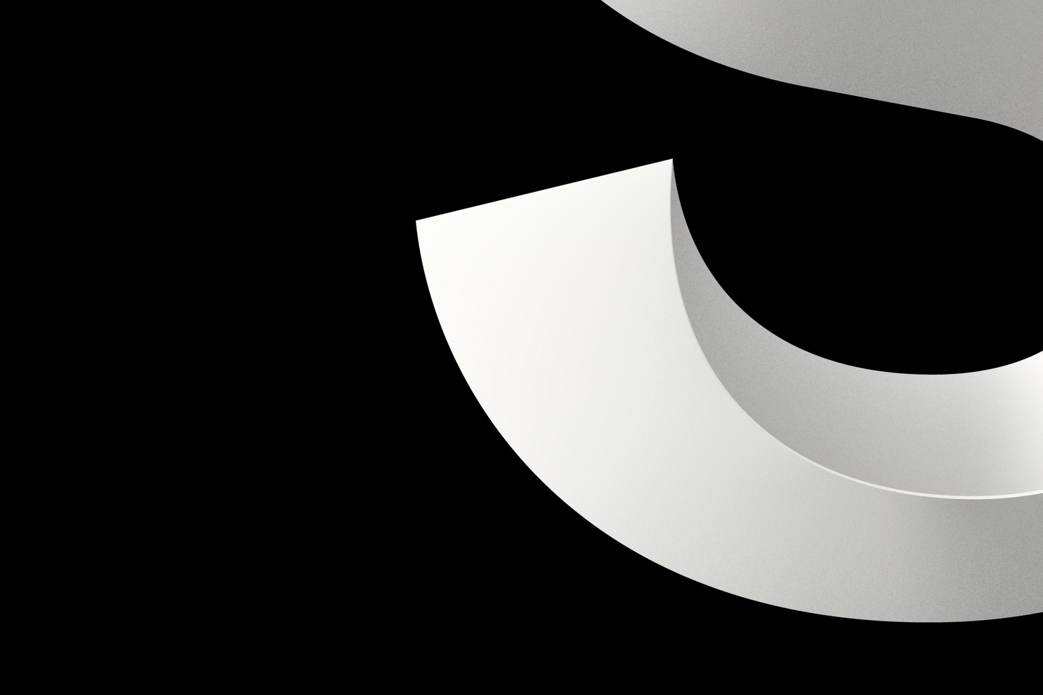


Utzon — named after the Sydney Opera House’s visionary architect, Jørn Utzon — is our display typeface. Built in an engineering program by acclaimed Swiss typographer Laurenz Brunner, it has all the structural integrity and detail it needs to be rebuilt in real life, and even 3D printed.
The best part? With the help of a custom-made InDesign script, anyone working with the Sydney Opera House can easily turn type into Utzon, too. Just plug your copy in, click the generate button, and let the script work its magic. It means while our typeface is visually striking, it’s also incredibly practical.


“As you enter the Minor or Major hall this explodes into a very rich expression of colours, which uplift you in that festive mood, away from daily life, that you expect when you go to the theatre, a play, an opera or a concert.”
Jørn Utzon

Utzon tapestry
While our core brand uses colours from the building’s exterior, comms linked to performances take on the mood of the content itself. Performance imagery and illustration come to the fore, while our secondary colour palette (inspired by Utzon’s artwork above) helps set the right tone.
And after we’ve celebrated our chosen performances, our typeface brings the attention back to where you’ll find them taking place – the Sydney Opera House.


Designed at Interbrand
- Executive Creative Director: Chris Maclean
- Creative Director: Oliver Maltby
- Design Directors: Tom Carey, Dan Ingham
- Writers: Lex Courtes, Jarred Bedford
- Motion Design: Collider, Mike Tosetto